 Michael Burpoe
Congratulations! You’ve decided to get serious about your online approach, but you are nervous about your strategy and converting sales. After all, why should someone choose to buy from your website versus some other major online website?
The main defining factors for selling online:
- Traffic - The number of quality visitors to your website
- Ease of Use - How easy it is for a shopper to find a product and check out with it
- User Confidence - The likelihood of the user actually wanting or purchasing the item
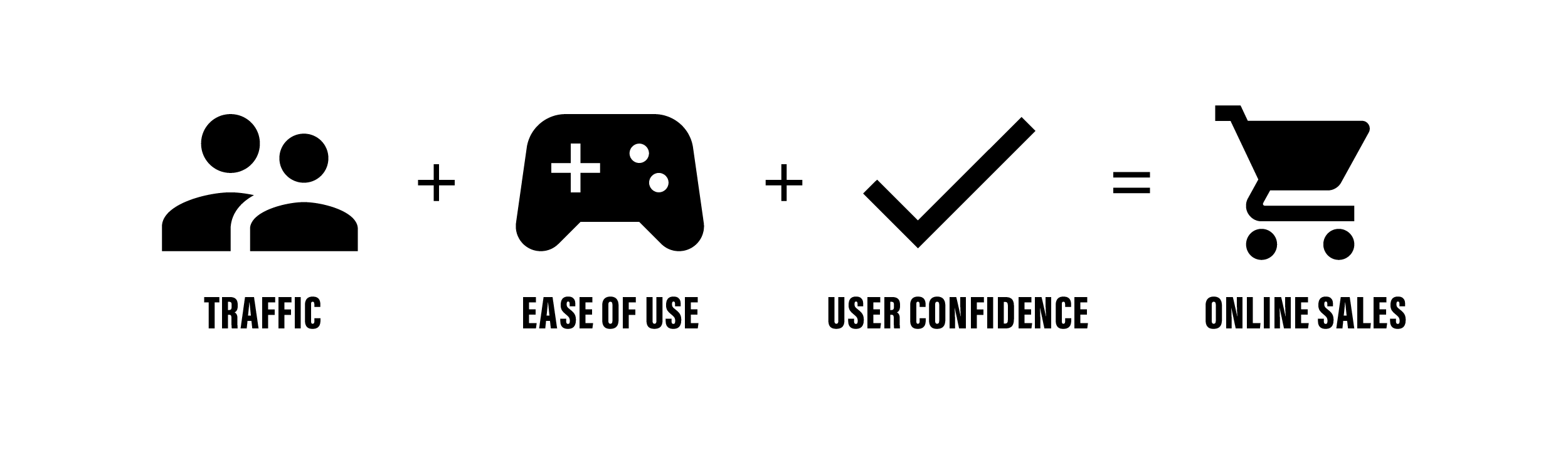
If you are able to focus on these three aspects, your website is assured to sell online.
Traffic
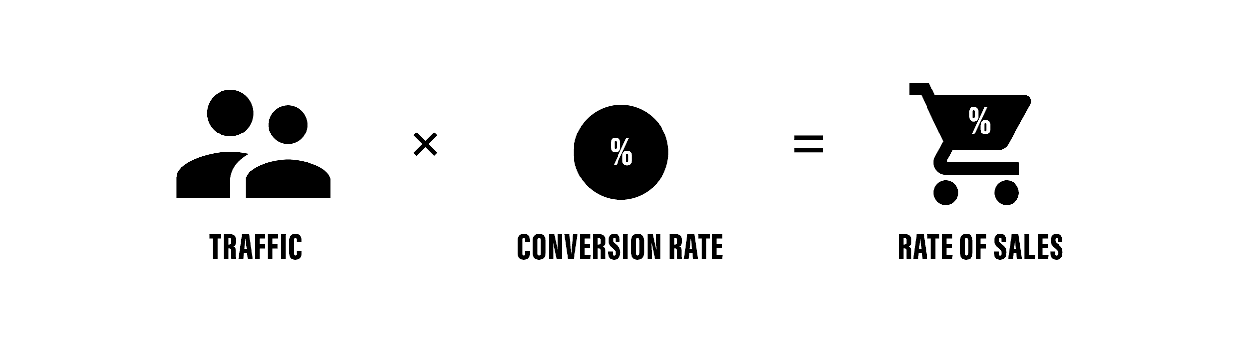
Sales is a numbers game, and in the end, no company can convert every lead into a sale. Therefore, it’s important to drive more traffic to your website than you think you need, so that when you factor in your website’s conversion rate, you are able to make the sales your store requires. A higher amount of traffic allows your store’s conversion rate to be less than ideal and still bring in sufficient sales.
Driving website traffic is slightly different than driving traffic to a physical store.
For physical stores, traffic is all about being top of mind, so that shoppers are willing to come in and browse your goods. This is why radio, newspaper, and billboard advertisements are effective. Ensuring that when a prospective customer thinks of the conundrum “My partner’s birthday is approaching, what should I get them so that they know how much I love them?” The following idea is “I should get them some jewelry from YourStore Jewelers!” because they have seen or heard advertisements about your store prior.
Another example would be a customer drives home from work, and they see great signage outside your store about your beautiful gift ideas, and see your display cases from the window and they decide to park and check it out.
Website traffic is slightly different. You could still opt to advertise so that your store’s presence is seen in a lot of places, creating top of mind awareness, however there are other strategies available that are exclusively for online business.
To name only one of these strategies, consider retargeting. Retargeting works so that if that a potential shopper is shopping around on other jewelry store’s websites, they are identified as a qualified lead, and as such they are served your ad, because the system has come to the conclusion that “If they are shopping at other jewelry sites, they probably want to buy jewelry. They should buy it at YOUR store!”
By targeting the leads that seem more in the buying mood, the conversion rate per lead is far greater and you aren’t spending as much time and effort just shouting into the void that is advertising. These leads and conversions are also measurable, so that when you send out an ad, you can track exactly how many times it has been viewed, the click-through rate, and many other metrics to determine if it is an effective advertisement. It’s difficult to do that with a billboard.
Ease of Use
Also known as User Experience (or UX), it can’t be overstated how important this aspect is. Similar to the flavor Umami, it can only be described by its effects on the surroundings. You know if it’s there and you know if it’s not.
Luckily, this is website design, and not molecular gastronomy, and the standards for good UX are easy to notice once you start looking for them, and I always recommend looking to e-commerce leaders across a variety of industries for suggestions.
Let’s do a quick experiment. Pull up:
These websites represent leaders in fitness apparel, beauty, furniture, and sunglasses. These industries are quite different from each other, however if you pull the websites up side by side, the similarities become very prominent.
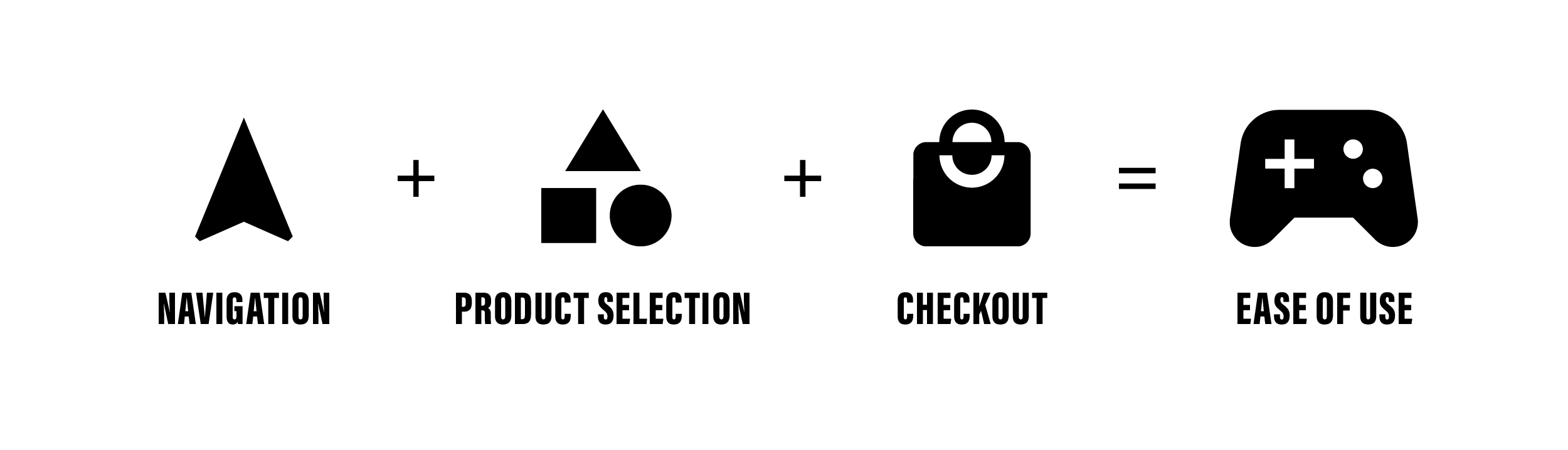
Navigating
All of these websites employ wide dropdowns, commonly referred to as mega-menus. This is because presenting the client with the correct items they are looking for is immensely important, especially if your website has thousands of products available. The average time on site is only 3.5 minutes which means you need to load up your site and get the perfect product in front of the customer ASAP, or they will be leaving soon.
Landing Pages
Mega-menus also allow a store to leverage landing pages for root categories and to create intermediary pages between the homepage and the moment a shopper is presented with products. This unique striating of your products invites the shopper to navigate with their eyes, instead of their minds.
For Nike, if a shopper is in the buying mood for a new pair of sneakers to match an outfit, one might think to present them with a product grid of all of their sneaker designs immediately. However if you click through their website, a discerning eye will be aware that a shopper flows through three pages prior to being presented with the product: Homepage > Men’s Landing Page > N7 Sneaker Landing Page > Shop the Collection. Of the four websites listed, every single one uses landing pages that filter the shopper visually.
By adding these landing pages, several actions are happening.
- Funneling - The number one thing these landing pages do is funnel the shopper so that they are only presented with viable options. Nike’s first question is if you are “shopping for a man or a woman?” Unless they are shopping for their significant other, it’s not helpful for a man to be presented with women’s shoe options.
- Product Filtering - By filtering a shopper through these pages instead of just all sneakers, you are presenting the consumer with a dozen hyper targeted products instead of 4,000. Lower product count but higher relevancy is easier to choose from as a shopper.
- Improved SEO - Increasing the number of pages that can be indexed by Google about relevant information to your business is one of the foundational elements for improving your search ranking by Google and placing you on the front page of Google.
- Adding Frill - Online shoppers are more discerning now than ever before. They need to be “wooed” into making a purchase with you rather than a different site, as convenience is hardly a factor over the web. This is also heavily tied to your website’s User Confidence score.
Product Consistency
All four of these e-commerce websites have their own flavor of how their products are displayed, and for good reason. Nike’s products are photographed in a dynamic and exciting way. Sephora’s products are more sterile to display their colors, but also includes demonstration videos and photos of models using the product. Whatever the strategy, every product is shot to match so that it feels consistent and on brand.
Footer
Finally, each of these e-commerce websites uses their footer, the global element positioned at the bottom of every page, to create deeper linking and increase time on page. Again, if you look at all four of the previously mentioned websites at the same time, you will notice that even though they are in four VERY different markets, they have very similar footer links. They are all centered around helping shoppers find the links that they searched the entire page for, and yet could not find.
- “Color” pages - About, Newsroom, Our Impact, Transparency
- Service links - My Orders, My Account, Return Policy, Contact Us
- Hours of Service - It is commonly assumed that a store’s hours (& location if applicable) will be located in the footer
- Social Links - Facebook, Instagram, Pinterest, Twitter
Unless you are paying a major advertising agency to build your website from scratch, you are going to be using a platform to support your website. The ease of use for your website often comes down to the granular pieces that are the result of the platform. Some common website platforms offer really solid fundamental back-bones for an e-commerce website, however choosing a platform that is specifically for e-commerce or specific to your industry (or both) is a great way to ensure all of the important features listed above are baked into your website at the ground level.
If you want a great e-commerce site with an easy to manage CMS, consider a revenue-driving platform like Punchmark.
User Confidence
Every time a buyer considers making a purchase, it is a battle between the product in front of them and every other option on the market. If you have a niche product, then you have less competition, resulting in a much higher user confidence that your product is the best option for them. If your product is common, then the buyer can (and will) go elsewhere if they are not confident your product will be delivered in a timely manner, and be exactly the quality that they are looking for.
I buy my sneakers from Nike.com instead of the mall or a different company because I am confident that the website will have my size and options for customizations, the delivery will be on time, and if the shoes don’t fit correctly, I can request a return seamlessly. If there was a fair likelihood that the delivered shoes would instead be the wrong model and wrong size (or the business didn’t exist), then I would go elsewhere to buy those shoes.
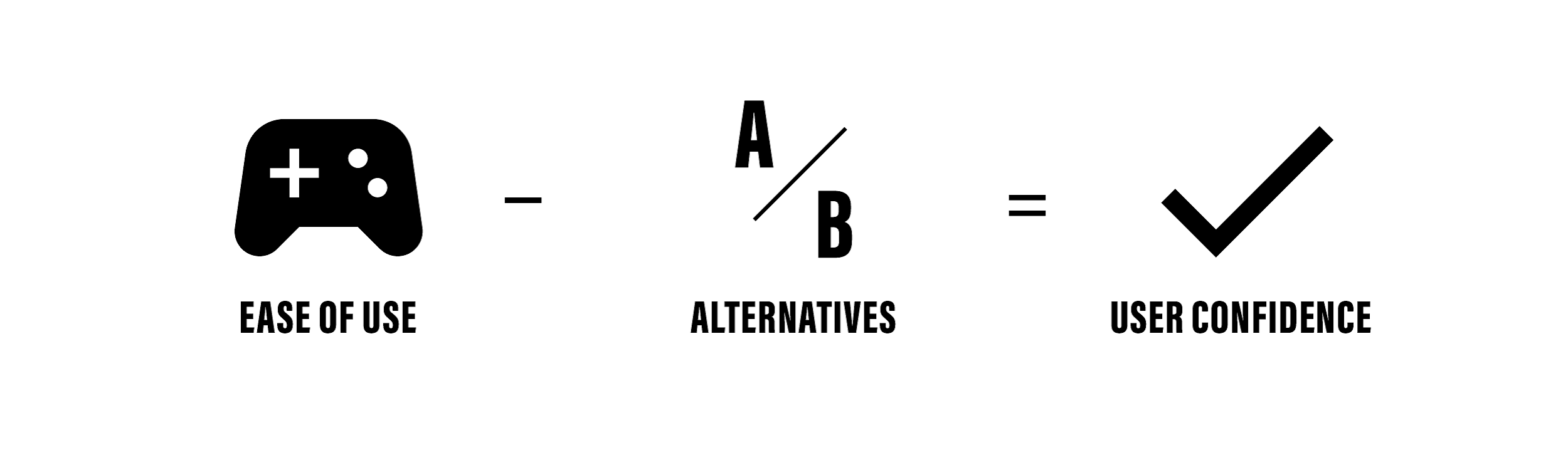
Your User Confidence score is a constantly fluctuating scale, which will go up and down depending on their perception of your website. As is commonly true with any form of trust, it is very easy to lose and difficult to gain back. The most efficient course of action is to ensure that you have your bases covered prior to presenting them to the customer, and to be constantly on the lookout for ways to improve.
Some factors that will impact your User Confidence score are:
- Inconsistent product photography or lack of alternative views of products
- Misspellings & grammatical errors
- Dead Links and other html bugs
- Inconsistent branding (or bad branding)
- Inability to find “color” information (About Us, etc.) about the company
- Inability to find customer reviews of products
- Inability to contact someone with questions
It is important to keep in mind that as the number of sales increases, so too will the risk of fraud. E-Commerce fraud is always a problem no matter how diligent you are about preventing it, but luckily, there are businesses that are devoted to exactly that, such as ClearSale,which plugs in to the Punchmark CMS in a turn-key way.
A website should feel like a labor of love, in that it will NEVER be complete. There will always be content to be written, imagery to update, additional landing pages to create, and ads to buy. However, by starting, you are building the base for your e-commerce website to improve from, which can become a major source for revenue in the future.