 Sarah Elizabeth
When it comes to increasing online sales and growing a business, merchants want to implement the sales strategies that quickly let them see impressive results.
One way for merchants to improve online sales with minimal cost and effort is with A/B testing. This simple strategy lets e-commerce merchants of all sizes experiment with their websites, gain valuable insights regarding their customers and their preferences, and implement the changes that help them get the most out of their website traffic.
Studies show that A/B testing can illuminate even small website modifications that can lead to double-digit improvements in conversion rates. Clearly, every e-commerce merchant should know what A/B testing is and how it can benefit their business.
What Is A/B Testing?
Businesses use A/B testing (sometimes called “split” or “bucket” testing) to find out which of two marketing variables customers find more appealing by launching the variables simultaneously and analyzing the resulting data to see which performed better.
For example, imagine a merchant is trying to decide which button is more effective at converting customers: the current “Add to Cart” button design (version A, known as the control) or a new button design (version B, called the variable). The merchant tests its options by dividing website traffic into two equal groups; randomly directing them to the page with either version A or B; and analyzing which option most affected customer behavior and improved targeted metrics (e.g., a higher conversion rate, a lower bounce rate, more sales).
11 Website Elements e-Commerce Merchants Can Easily A/B Test
Although the sky’s the limit when it comes to choosing elements to modify, these 11 A/B tests are a good place to start:
1. Change Your Tone
Consider changing the tone of website text to see what style resonates with customers. Some may relate better to casual narrative copy, while others might prefer more formal, concise text. While keeping the target audience in mind, make slight variations to tone (casual or formal), copy (informative versus creative) and sense of urgency (“Sale ends today!”).
2. Switch Up the Navigation
Different navigation elements — like drop-down or floating menus or breadcrumb navigation — can easily change a customer’s shopping experience by making pages and products easier or harder to find.
And it’s just not what kind or navigation you use, but also:
- • Where the navigation is located on the page, like on the top, left- or right-hand side
- • The order of navigation items — which is positioned highest
3. Make Product Recommendations
If merchants aren’t including up-sells or cross-sells on their product pages, they might be missing the opportunity to increase the dollar value of an order. Other merchants, however, might prefer to not distract customers with a cluttered page of related products.
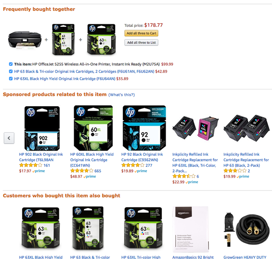
Test a variety of pages, like one version with no up- or cross-sells and another that displays products related to those in a customer’s cart, similar to Amazon’s suggested product list.
4. Play With Pricing
There’s no doubt that the way a merchant prices items affects how customers perceive a product. For example, a product priced “$999” is generally thought to be a better value than the same product priced “$1,000,” despite the difference of just a dollar. Ending pricing with the number 9 can even outsell lower prices: The Journal of Quantitative Marketing and Economics found that jeans priced at $49 outsold the same jeans priced at $44 by 24%.
Merchants can also experiment with pricing strategies by:
- • Testing a price match guarantee, offering to refund customers the difference if they find a lower price on the same item elsewhere.
- • Displaying prices on the left and the right sides of a product image to see which is more popular.
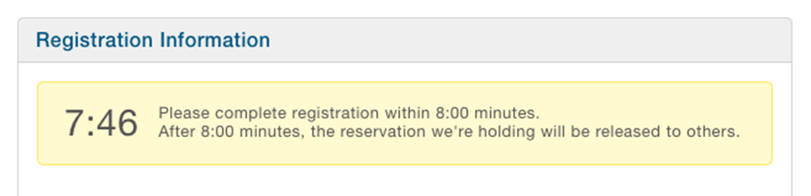
5. Create a Sense of Urgency
Sometimes the fear of missing out can nudge customers to make a purchase. Sites like EventBrite show a countdown timer, letting customers know how long they have to make a purchase before their items are released to another customer.
Merchants like Zulilly and Hotels.com often display the number of items remaining when inventory gets low, subtly influencing customers to make a quick purchase.
6. Change Up CTAs
Call-to-Action (CTA) buttons offer a wealth of A/B testing options, including:
- • Shapes. Test rectangular, oval or even irregularly shaped buttons to see which one captures customers’ attention.
- • Text. “Buy Now” is short and sweet and can increase conversions, but “Add to Cart” may increase average order values. “It’s Free” can increase signups by up to 28%.
- • Location. Generally, complex offers feature CTAs near the bottom of the page; other offers may do best with multiple CTAs strategically placed throughout a page.
- • Size. Small CTAs may be easily overlooked, while large CTAs may be distracting and off-putting to the reader.
- • Color. Play with color to make sure CTAs stand out from website copy. When CareLogger changed their CTA color from green to red, they realized a 34% increase in conversion.
7. Add Pop-Up Windows
While some users find pop-up windows distracting, they’re effective: The only way to close them is by taking action.
Merchants can use that action to their advantage by adding pop-up windows that encourage social sharing, display related products or offer a buy-it-now discount code.
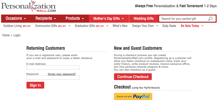
8. Allow Guest Checkouts
Forcing customers to register for an account is risky. While it gives merchants the data needed to target and reactivate customers in the future, it also increases the risk of cart abandonment. Testing mandatory and optional account registration lets merchants evaluate the long-term value of increasing the visitor bounce rate while gaining valuable customer data.
9. Reduce the Number of Checkout Fields
Some studies report that conversion rates decrease 10% with each additional field customers must complete. Test that theory by eliminating fields that aren’t essential to completing a sale — like title or company name.
10. Change Up Your Offers
Merchants who don’t offer free delivery can test the effects of offering free shipping for orders above a certain dollar amount on conversions. It may reduce cart abandonment (especially for those merchants who don’t usually display shipping costs until late in the checkout process) and increase the average order value to hit the free-shipping minimum.
11. Offer the Chance to Chat Before Checking Out
It’s not unusual for customers to have order questions while shopping online; in fact, 44% of online shoppers want live assistance when making a purchase. Test having a live chat option on checkout or product pages to encourage purchases.
Get Started With Increasing Online Sales, Customer Security
Trying any of these A/B testing ideas today can help e-commerce merchants make controlled changes to the user experience while gaining valuable data on the outcomes. The result? Merchants attract more traffic, convert additional leads, create the optimal user experience and generate more revenue.
But A/B testing won’t solve every challenge an e-commerce merchant faces. Card-not-present fraud is on the rise and poses a serious threat to a growing business’s revenue and chances for success.
Contact the experts at ClearSale today to learn how our easy-to-implement, comprehensive fraud protection solution protects customers and merchants against savvy fraudsters and threats to e-commerce security, making the entire online shopping experience enjoyable and safe.